Blue Skies

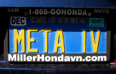
License plate design has really gone downhill. Current Illinois plates, for instance, don't even bother to place Lincoln's head in between the numbers and letters. And the only thing distinguishing current California plates from the rest is a cheesy cursive typeface. I miss the old days, when plates were completely different colors and didn't have little drawings cluttering the sides. California's old blue-with-yellow-type plates, for instance, were perfect. They were simple yet distinctive.

3 Comments:
Where did you spot the META IV plate?
In the staff parking lot at school.
The new Indiana plates are flat and plastic. They're horrible.
Post a Comment
<< Home